Kurilpa Common
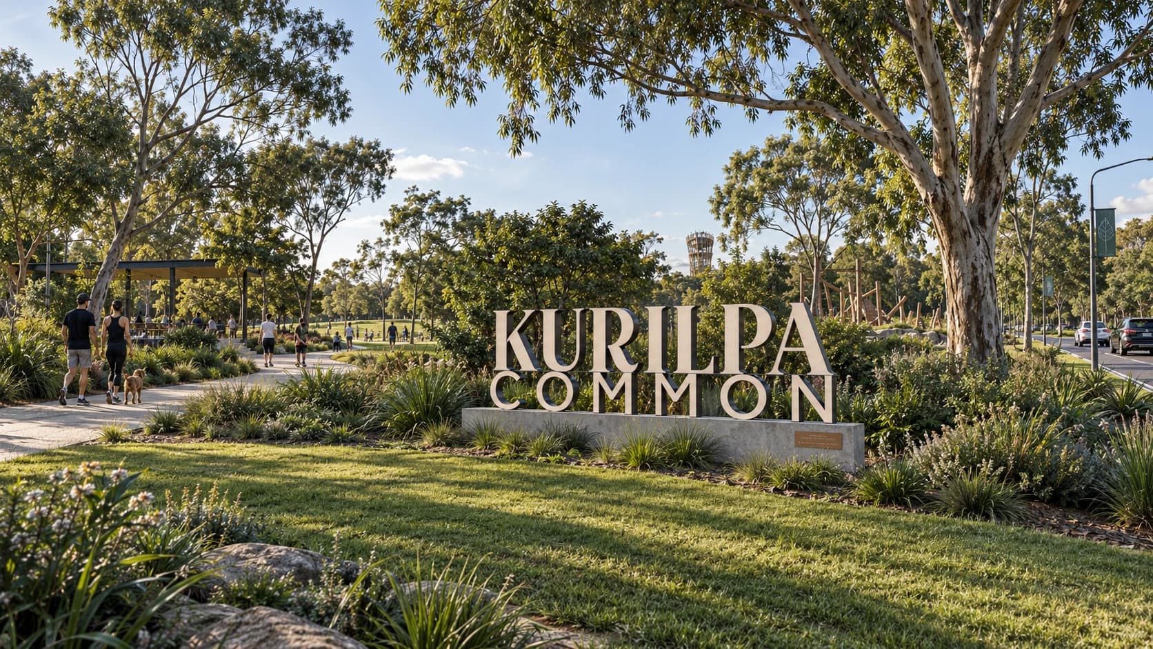
Where West End gathers.
An imagined civic identity for Davies Park, developed by Milosh Acimovic for a university typographic systems project. Kurilpa Common brings naming, signage and digital design into one visual language, shaped by the history and everyday life of West End.
One place.
Many communities.
The brief explored how Davies Park could read as a shared destination while retaining the individual identities of its sporting clubs, markets and other activities. The proposed identity provides a common framework rather than replacing those distinct voices.
This is an academic design concept, not an official renaming or an identity commissioned or adopted by Brisbane City Council. The applications shown are proposals and mockups.
A name for
shared ground.
The proposed name brings together Kurilpa, a name associated with the West End peninsula, and “Common”, a reference to shared public ground. It expresses the project’s central idea: a place held in common.
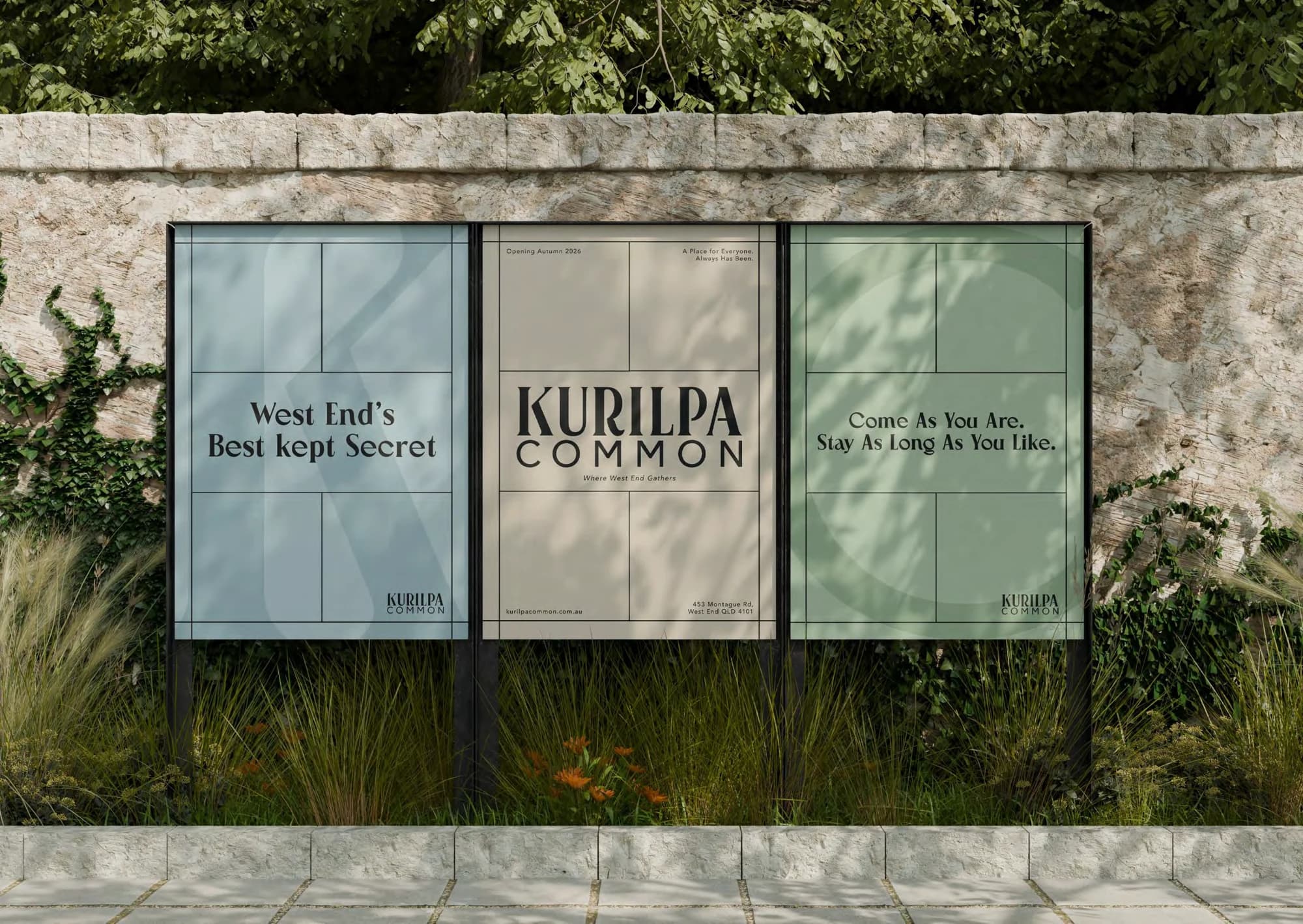
The 1895 McKellar survey provided the starting point for the visual system. Its grid informed the composition of posters, the proportions of wayfinding panels and the structure of the website.
The identity
Pioneer Boulevard gives the identity its civic character. Paired with Avenir for everyday information, it connects a sense of history with a clear, contemporary public voice.

The initial becomes a secondary identity device.

Where West End gathers.
Pioneer Boulevard · RegularA shared place by the river. Room to meet, explore and enjoy the everyday life of West End.
Avenir · BookThe colour palette
Sand, sage, dusty blue and foam draw on the riverbank, greenery, sky and light. Near black anchors the typography and wayfinding.
- Sand#D8CCBA
- Sage#ACC3A8
- Dusty Blue#B4CBD0
- Foam#F8F6EB
- Near Black#1E1E1E
From arrival
to everyday use.
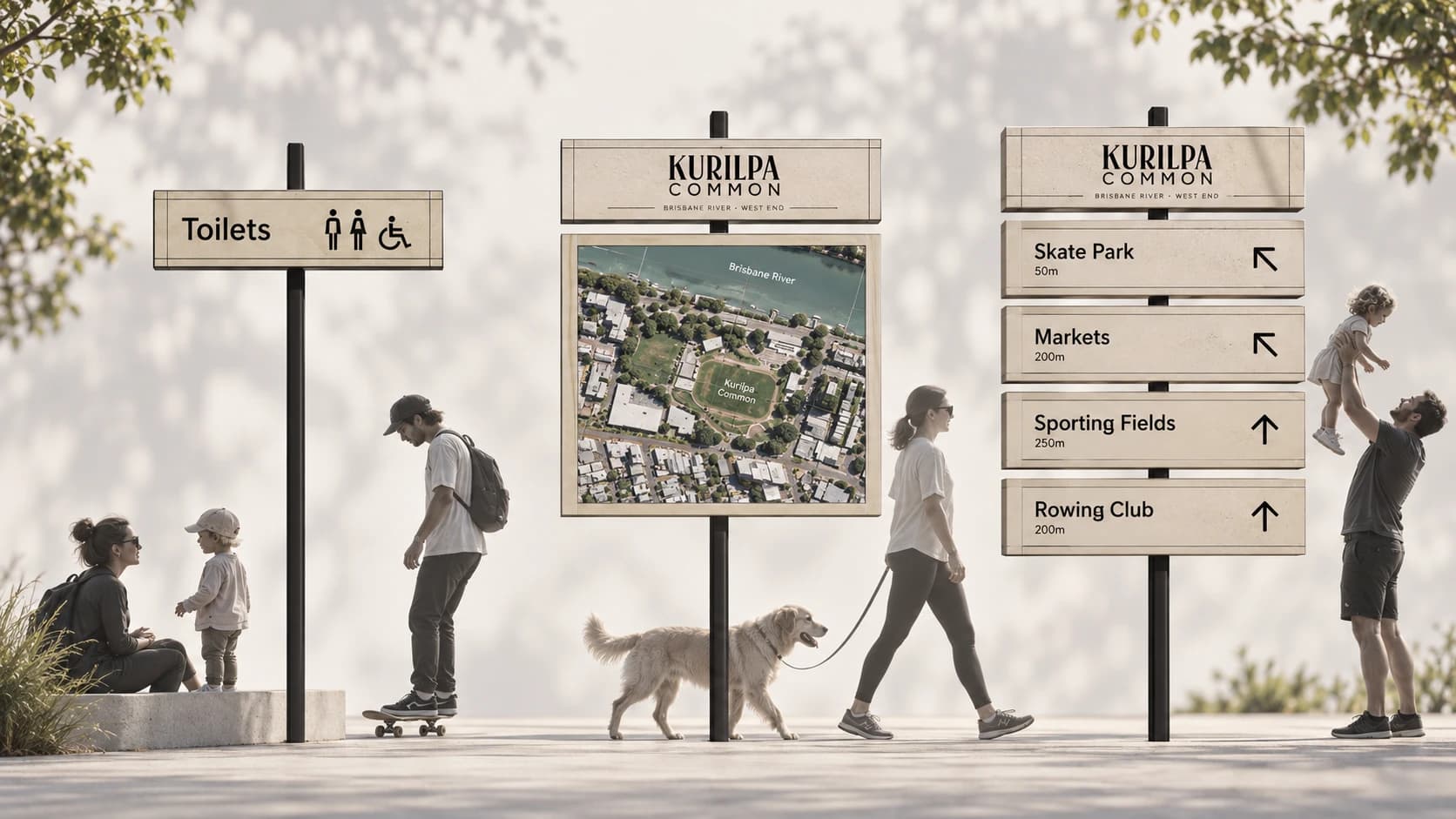
Sand-coloured directional panels are designed for contrast beneath the tree canopy. Sage marks destinations, while a larger typographic landmark gives the proposed identity a presence at the park entrance.
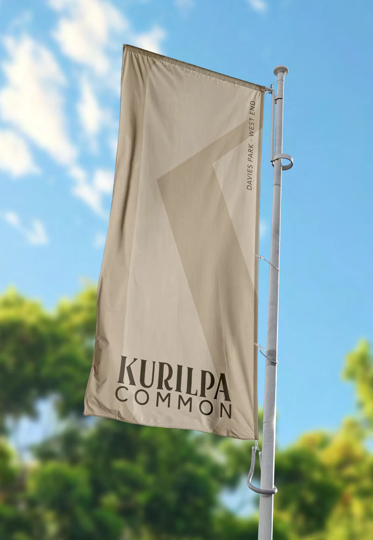
The mobile-first website carries the same system into practical visitor information. Flags, posters and everyday objects show how the identity could extend beyond the signs.
Scrollable landing-page design preview. Pictured menus and links are inactive.



Project context
Research included the 1895 McKellar map and the park’s local history. Council’s heritage record dates the land purchase to 1900, the official opening to 1901 and the renaming as Davies Park to 1909.
Davies Park heritage record ↗︎Have a similar
challenge?
Tell us what you’re working towards. We’ll help you work out the right next step.
Start a projectNo finished brief needed. We’ll reply within 48 hours.