Daisy's Place

Rooted in history, reimagined for today.
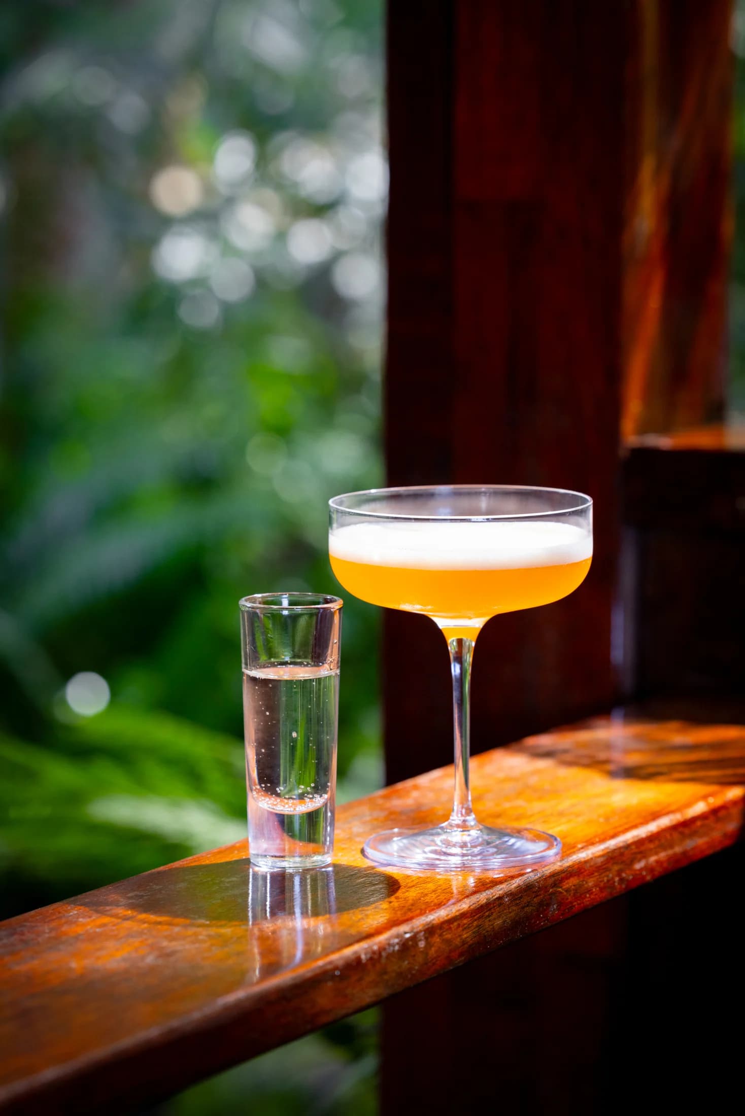
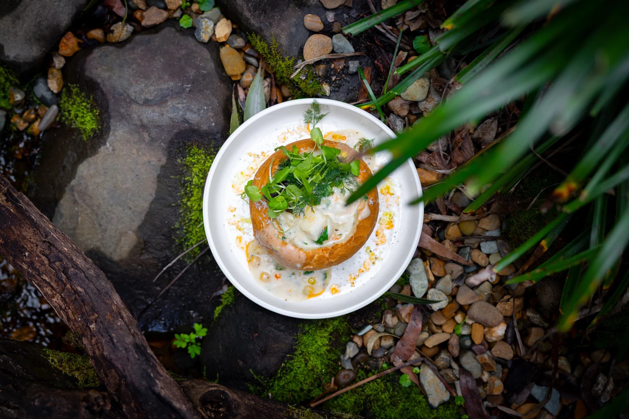
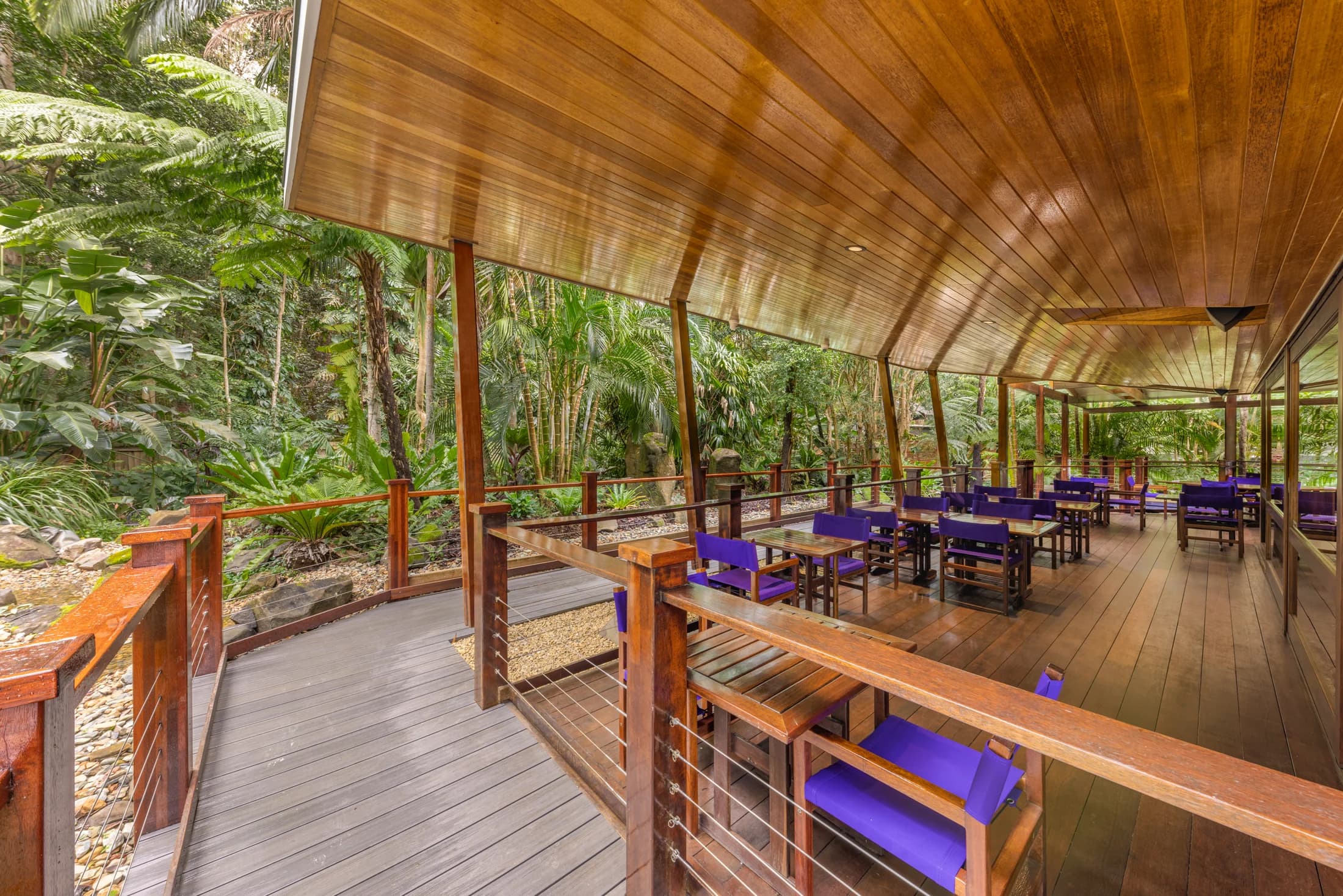
Nestled within the rainforest of the Sunshine Coast hinterland, Daisy’s Place has welcomed generations of locals and visitors alike. The rebrand sought to preserve that familiarity while elevating every touchpoint through a refined visual identity, premium print collateral and a renewed sense of place. Every detail was designed to feel considered, timeless and unmistakably Daisy’s.
The challenge
Despite its loyal following and unique rainforest setting, Daisy’s Place lacked a cohesive identity that reflected the quality of the dining experience. Branding had become inconsistent across menus, signage and customer touchpoints, making it difficult to communicate the venue’s character or position it as a destination rather than simply a local restaurant.
The challenge was to create an identity that respected its history while introducing a more premium, contemporary presence without losing the warmth and familiarity that existing patrons valued.
The approach
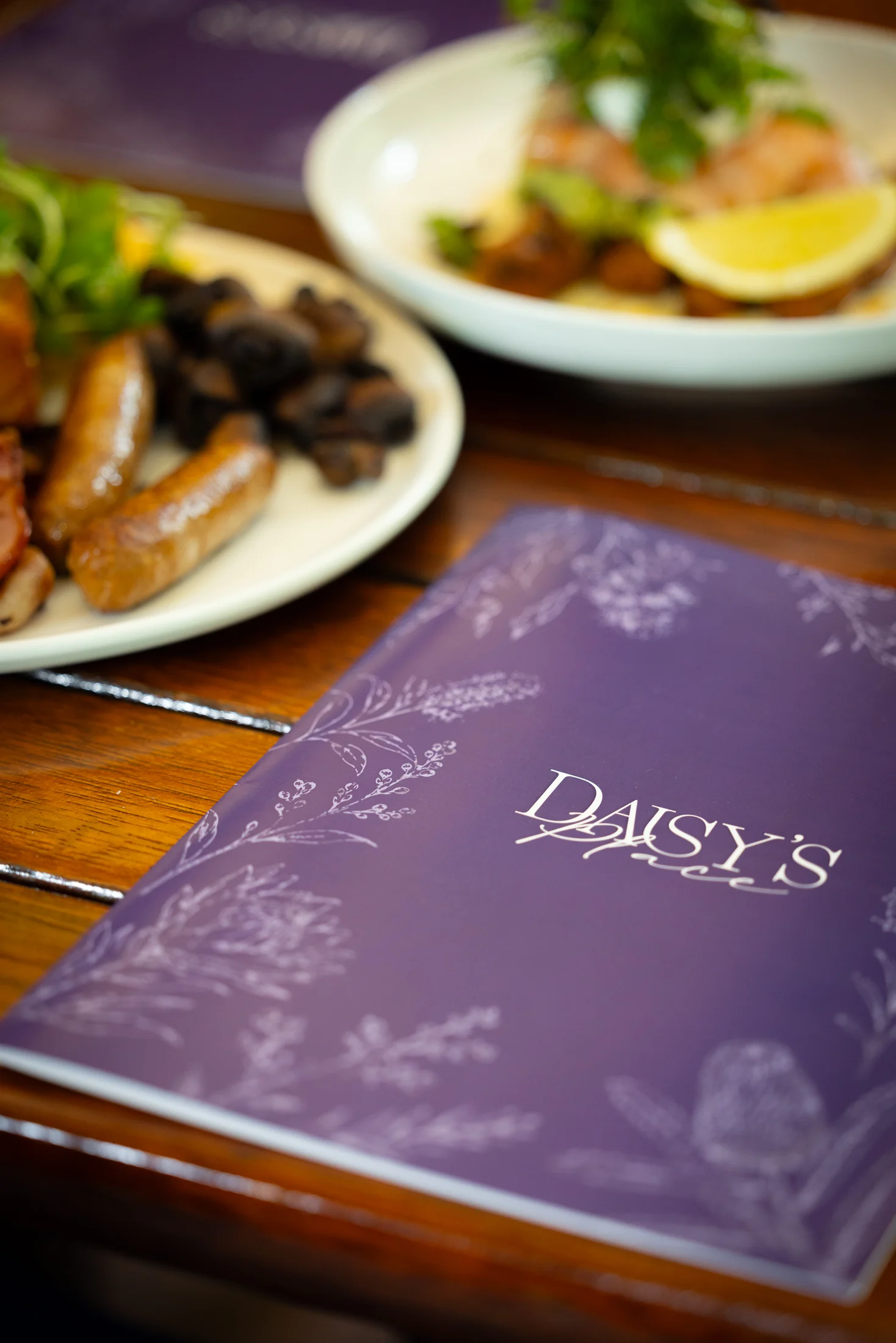
The project introduced a complete visual identity centred around elegance, craftsmanship and the surrounding landscape. Inspired by botanical illustrations and the venue’s lush gardens, the identity combines restrained typography, refined detailing and a signature deep purple palette to create a memorable and sophisticated experience.
Every customer interaction was redesigned, from exterior signage and menus to coasters, printed collateral and environmental graphics, ensuring a cohesive brand experience from arrival through to the final course. The result is a brand that feels elevated yet approachable, positioning Daisy’s Place as one of the Sunshine Coast hinterland’s most distinctive dining destinations.
The identity
An elegant serif and a handwritten signature bring refinement and warmth together. The wordmark and intimate “dp” monogram give Daisy’s Place a recognisable presence, from signage to the smallest table detail.

A welcome, restored.

A place to gather,
dine and return to.
Notes to the Garden
RaffishlyA structured serif for presence. A handwritten accent for a personal touch.
The colour palette
SDJ Purple anchors the identity. Lavender softens it, while charcoal, Silver Mist and white give the system contrast and breathing room across menus, signage and print.
- SDJ PurpleThe signature colour#422361
- LavenderA softer counterpoint#B5A2CE
- Deep CharcoalDepth and contrast#1C1B1C
- Silver MistA gentle neutral#E5E3E2
- Pure WhiteClarity and space#FFFFFF

Have a similar
challenge?
Tell us what you’re working towards. We’ll help you work out the right next step.
Start a projectPlanning a project in the region? See our Sunshine Coast branding and logo design services.
No finished brief needed. We’ll reply within 48 hours.